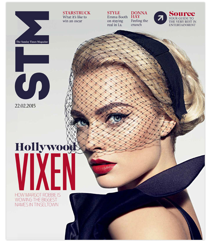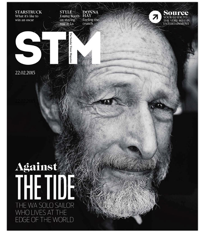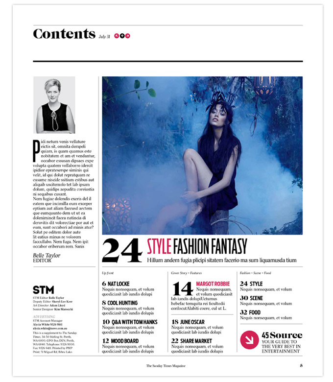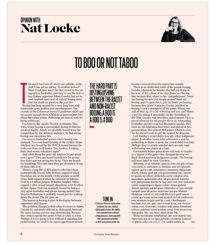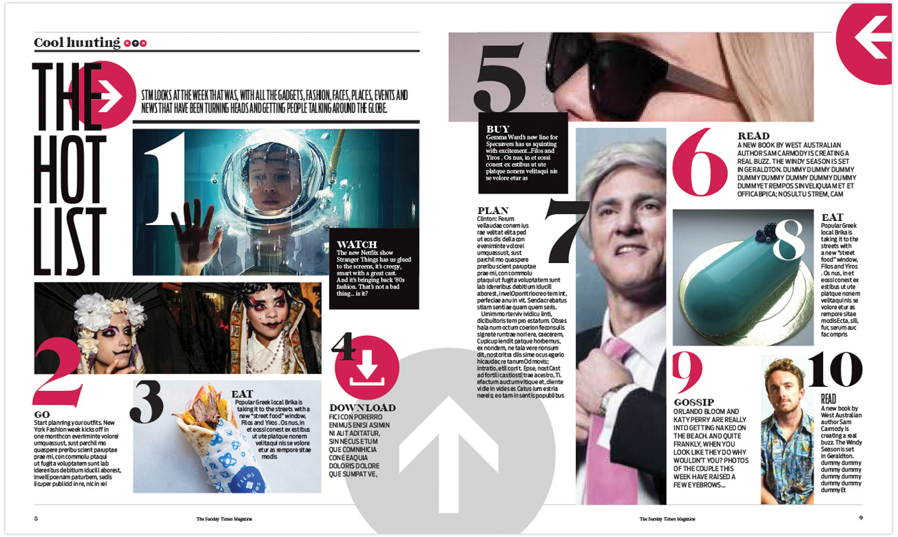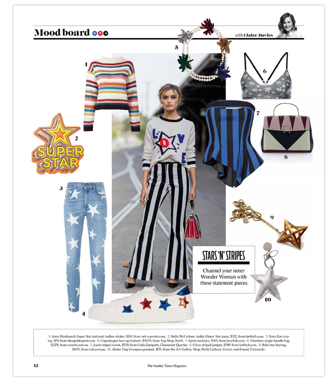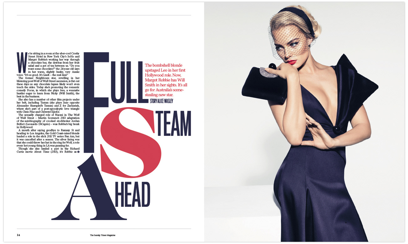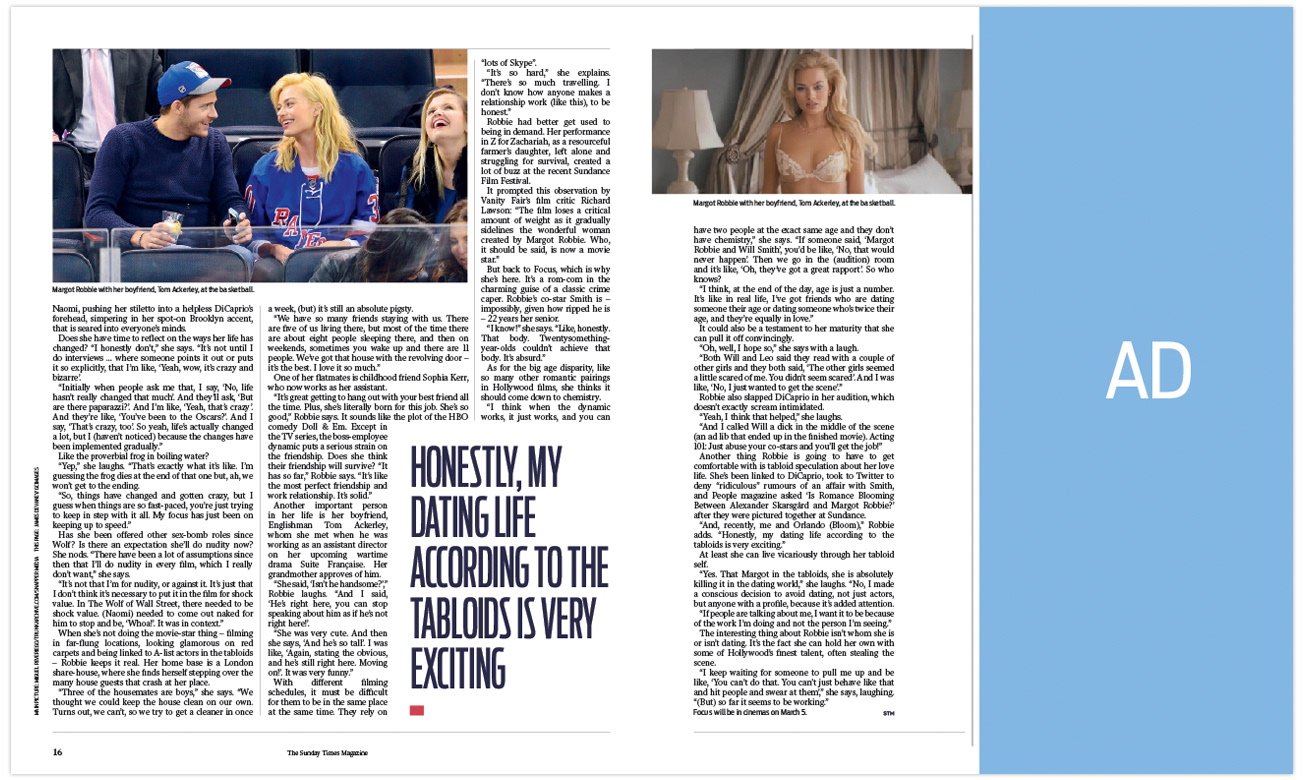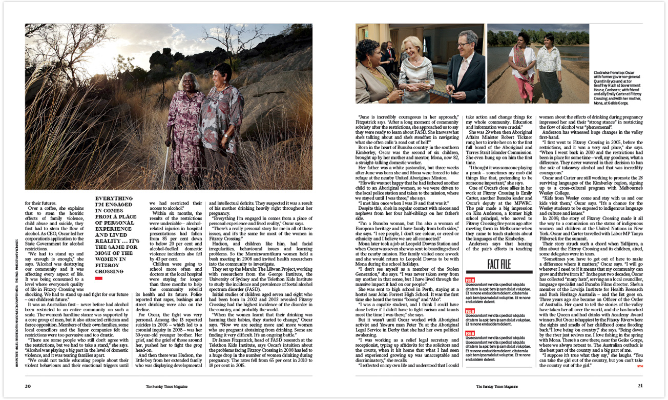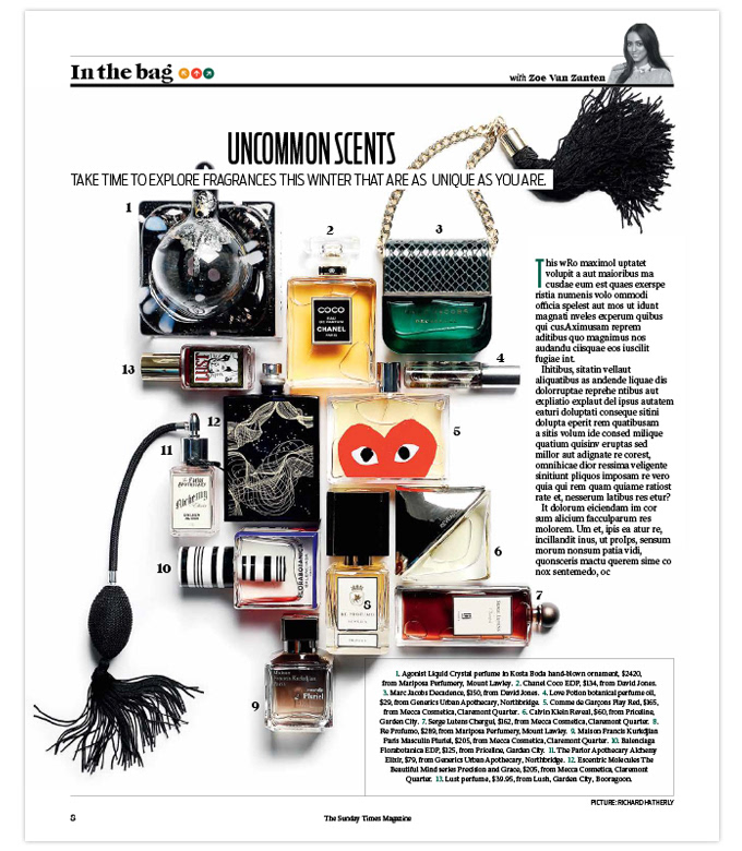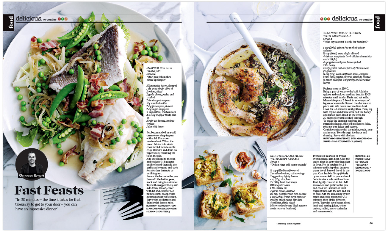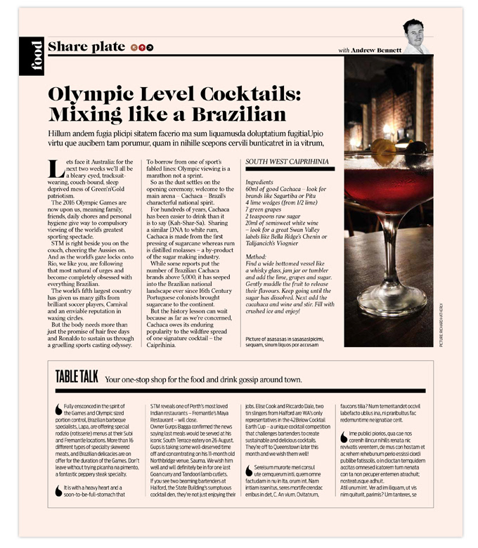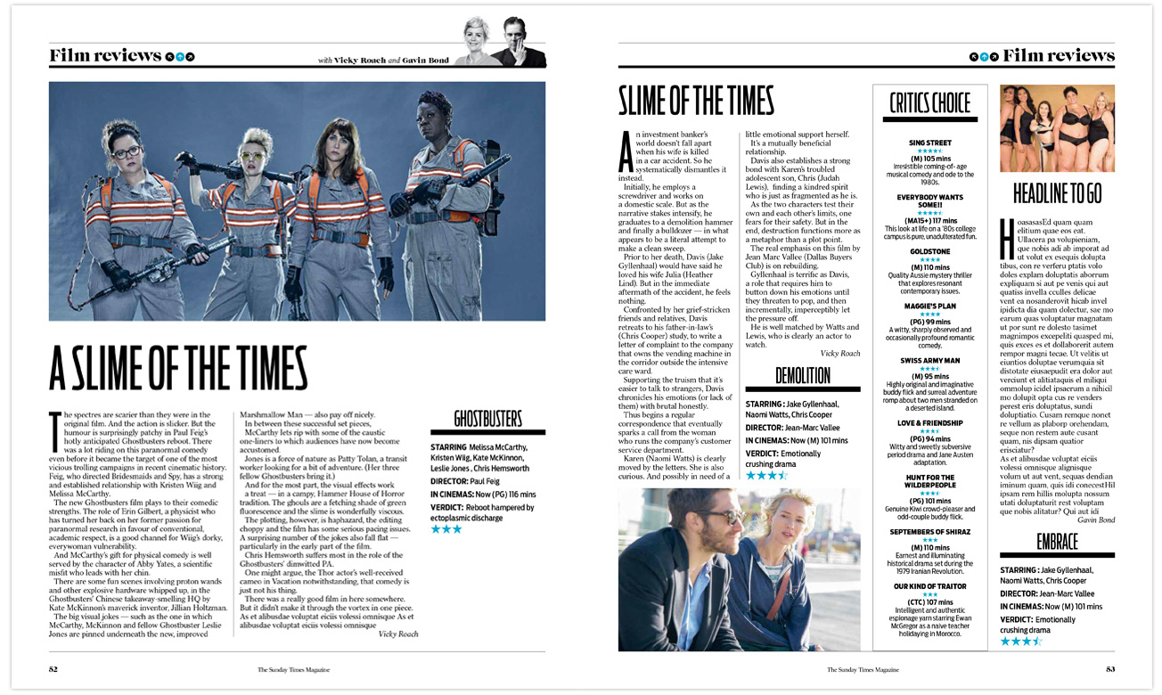


Was given the task to create a mock 72-page magazine in two weeks that combined The Sunday Times Magazine (STM) and The Sunday Times Guide (The Guide) entertainment magazine into one product. The new design started with a typography that would aesthetically work for TV listings - something clean that utilised white space. The TV section also needed it's own cover inside the magazine. Colour was added to give a subtle hint that readers were in a new section. The Hot List page was turned into a new highlight that was designed to be organic and image driven and a key feature to the front of the book. A special treatment was givento all column/opinion pages by adding a tint and increasing the size of the headshots for columnists to really boost STM's personality. The end result had an overwhelming positive reaction.
